
Roots to Fruit // Conference and Event Branding
This year, my work held a conference in the Middle East that was designed to host our staff for a time of rest and recovery. The theme given to us this year was called “Roots to Fruit” and was based off of John 15:4.
The logo and branding for the conference needed to be able to accommodate both English and Arabic as there were native speakers from both languages that would be represented in attendance. This was a fun challenge for me as I do not know how to speak or read Arabic!
For the conference, we were commissioned to design a logo, programs, promotional materials (such as stickers and backpacks), table decorations, room decor, name tags, prayer cards, thank you cards for donors and any other print materials that may be needed. From the beginning of the project until the end, we were given about 3 weeks. Our team of 7 worked extremely hard to pull off this project, and I am super proud of how everything turned out. Check out the conference branding below!
Process:
When starting, there were 3 logo drafts that were initially presented to the area leadership, and they chose which they liked for the theme. Below you can see our beginning iterations that were initially sent to the conference planning team.


I personally worked the most on this one, hand drawing each of the fruits and placing them within the diamond.

These are the first iterations of the chosen logo.
Finalized Brand Elements:

These logos are the revised, and correctly translated versions of our rough drafts. The color palette was also modified to become cooler and more restful and calming, as the conference was designed to be a place of rest.
Once the branding and logo elements were finalized, our team began to design the other elements for the conference.
Name Tags:
The name tags designed were created to designate those who were working the conference from those who were attending. The orange badges designated staff, the light blue was donors and the dark blue represented regular attendees.


Here is an image of a completed name tag, photographed by me and styled by me and my teammates on the conference design team.
Banners, Stickers and Backpacks:

Here is a couple of banners that we designed to display around the conference venue.


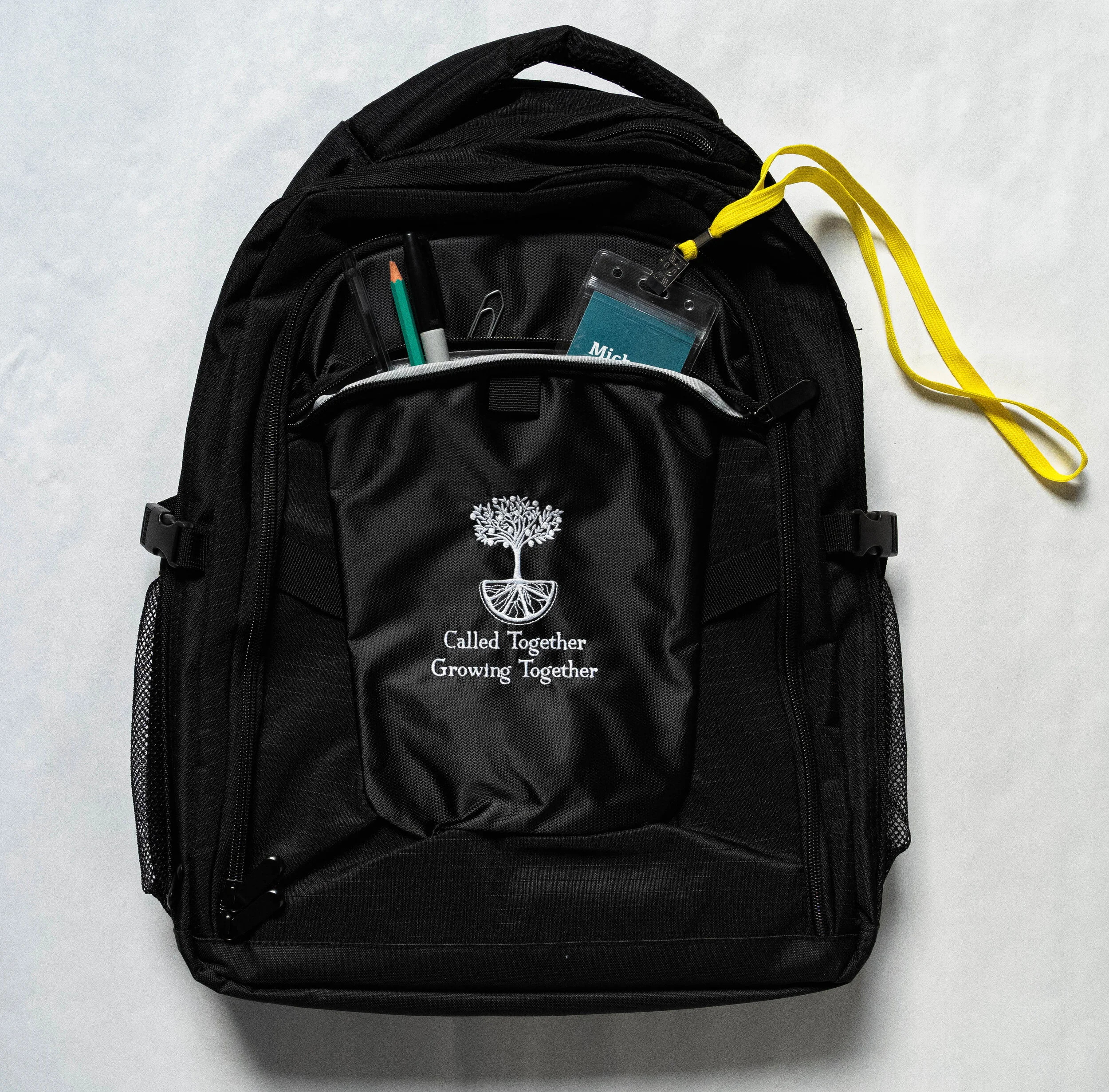
And stickers and backpacks to give out at the conference.
Printables:


These post cards were designed for the prayer room so that people who attended the conference could suggest areas where they were requesting prayer.


These thank you notes were designed to be given to donors of the conference.


SUPER proud of my team for working so hard on this project on such a short deadline, and very excited with how it all came out!!